
Framing is important for art presentation. It protects the art and can change how we see it. This post will explore how the colour of a frame can affect our perception and appreciation of art. Key terms like frame, colour theory, and artwork presentation will be defined.
Historical Context and Evolution of Art Framing
Frames have been used for centuries to enhance and protect art. During the Renaissance, frames were often elaborate to match the grandeur of the art. In the Baroque period, they became even more detailed. Over time, frame styles and colours have changed with art trends and cultural preferences. Famous paintings like those by Leonardo da Vinci originally had specific frames that influenced how they were viewed.
The Science of Colour Perception
Colour theory helps us understand how frame colour affects art. It involves hue (the colour itself), saturation (the intensity), and brightness (how light or dark it is). Colours can make us feel different emotions; for example, blue can be calming, while red can be exciting. The frame’s colour can enhance or lessen these effects.
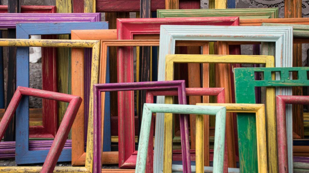
Frame Colour and Visual Impact
The contrast between the frame and the art is crucial. Complementary colours (opposite on the colour wheel) make the art pop, while analogous colours (next to each other on the colour wheel) create harmony. The frame’s colour can also affect how light and shadow interact with the artwork, changing how we see it.
Psychological Implications of Frame Colour
Different frame colours can make us feel different emotions. For example, a black frame can seem sophisticated, while a white frame might feel simple and clean. In galleries, frame colours can change how people feel about the art.
Cultural Significance of Colours in Framing
Different cultures see colours differently. For example, black might be elegant in Western cultures but have other meanings in Eastern cultures. It’s important to consider these cultural differences when choosing a frame colour, especially for culturally significant artworks.
Practical Considerations for Choosing Frame Colours
When choosing a frame colour, think about lighting, wall colour, room decor, and the purpose of the display. For personal spaces, the frame should match the decor. In public galleries, the focus should be on the art. Digital tools can help you test frame colours before making a decision.
The Art of Custom Framing
Custom framing lets you choose the perfect frame colour and material for your art. Artists and collectors can work with framers to select the best options. New technologies make it easier to visualize different frame choices before deciding.
Future Trends in Art Framing
Art framing is always evolving. New trends and practices in frame design and colour selection are emerging. Sustainability is also becoming important, with more eco-friendly materials and colours. Future advancements will continue to improve both the look and environmental impact of frames.
Choosing the right frame colour is crucial for how we perceive and appreciate art. Understanding colour theory, psychological effects, and cultural contexts can help artists, collectors, and galleries make better choices. Experimenting with frame colours is encouraged to find the best combinations.
Credit:
Featured Image by Jessica Ruscello on Unsplash